Let's first take a look at a fantastic example taken from one of our creators.
Scorpio's well-designed Creator Page allows his fans to consume his content more comfortably than ever before.
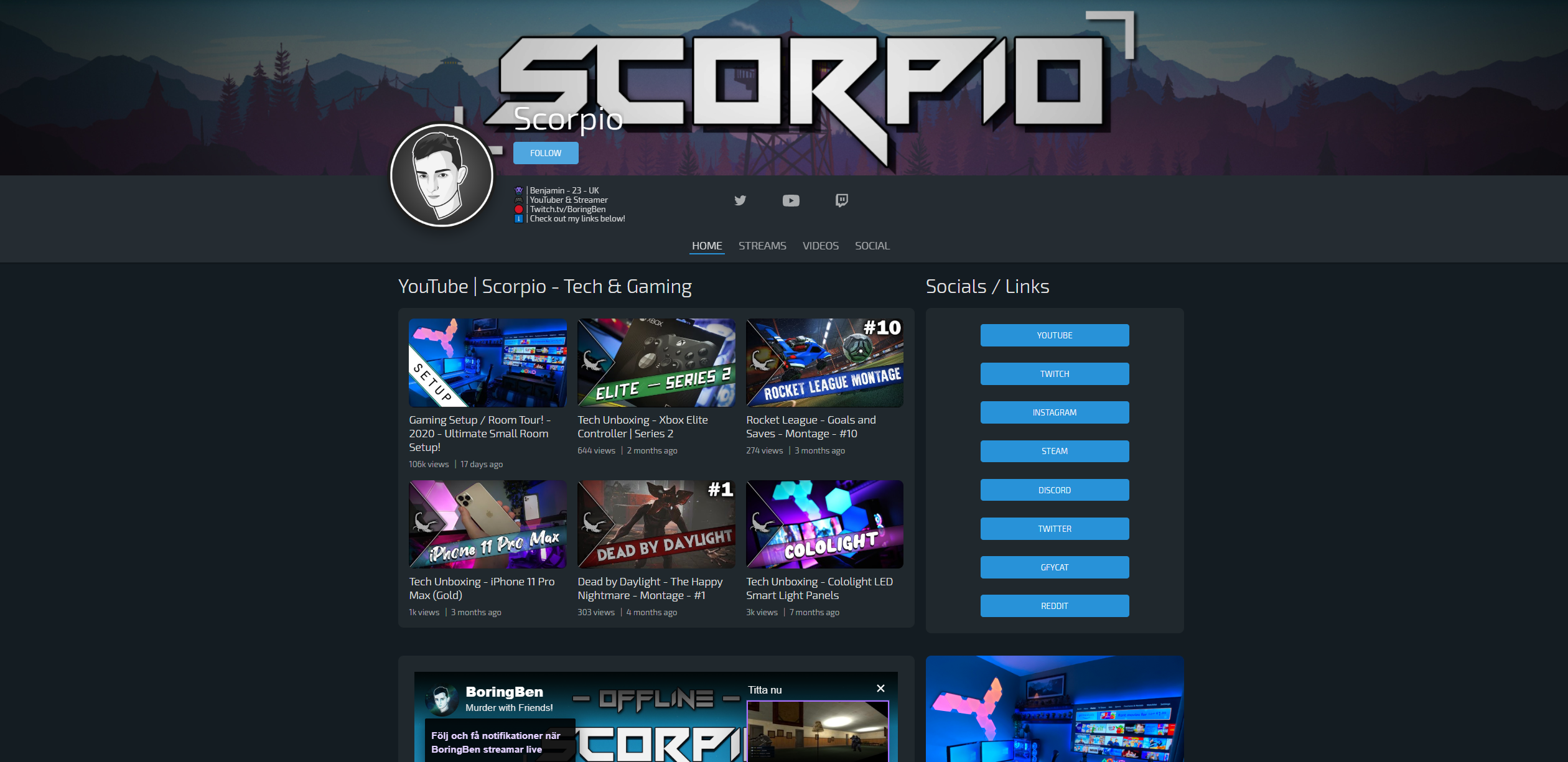
Convincing, right? Now let us dive into the tips on how to make your Creator Page look just as snazzy!
1 - Properly sized banners and pictures
Make sure you properly crop your banner and profile picture to the suggested sizes - this will make your Creator Page look a lot better. Check out the image below for our suggested banner guidelines:

In case you haven't decided how you want to design your brand yet, feel free to pop into our Discord and exchange ideas with other creators!
2 - Exploring the functions of each integration
We like giving you the freedom of choice when it comes to how you want to present your content and how you want to highlight it as well.
If you take some time to play around with editing your Creator Page, you will notice that each integration has multiple options in terms of how you want it to look.
We recommend trying out a few alternatives to get a feel for what suits your content best.
3 - Formatting your bio
The primary goal of your bio is informing your audience you are, as well as to pique their interest in your content.
Whether you do this by telling your life story or a quicker summary is entirely up to you. However, we have noticed that thought-through and clean formatting will significantly improve the visitors' experience.
We recommend:
- Emojis
- Bullet points
- Using newlines
4 - Asking your community for feedback
In the end, what ultimately matters is what your fans who rigorously follow your page think about it.
Feedback can come in many different shapes and forms, but your viewers most definitely will give valuable insight as to what they like or dislike when looking at your content and branding.
Whenever you make some changes, try asking them for feedback.
As mentioned above, you can also ask other creators in our Discord if they have some insight about your page!